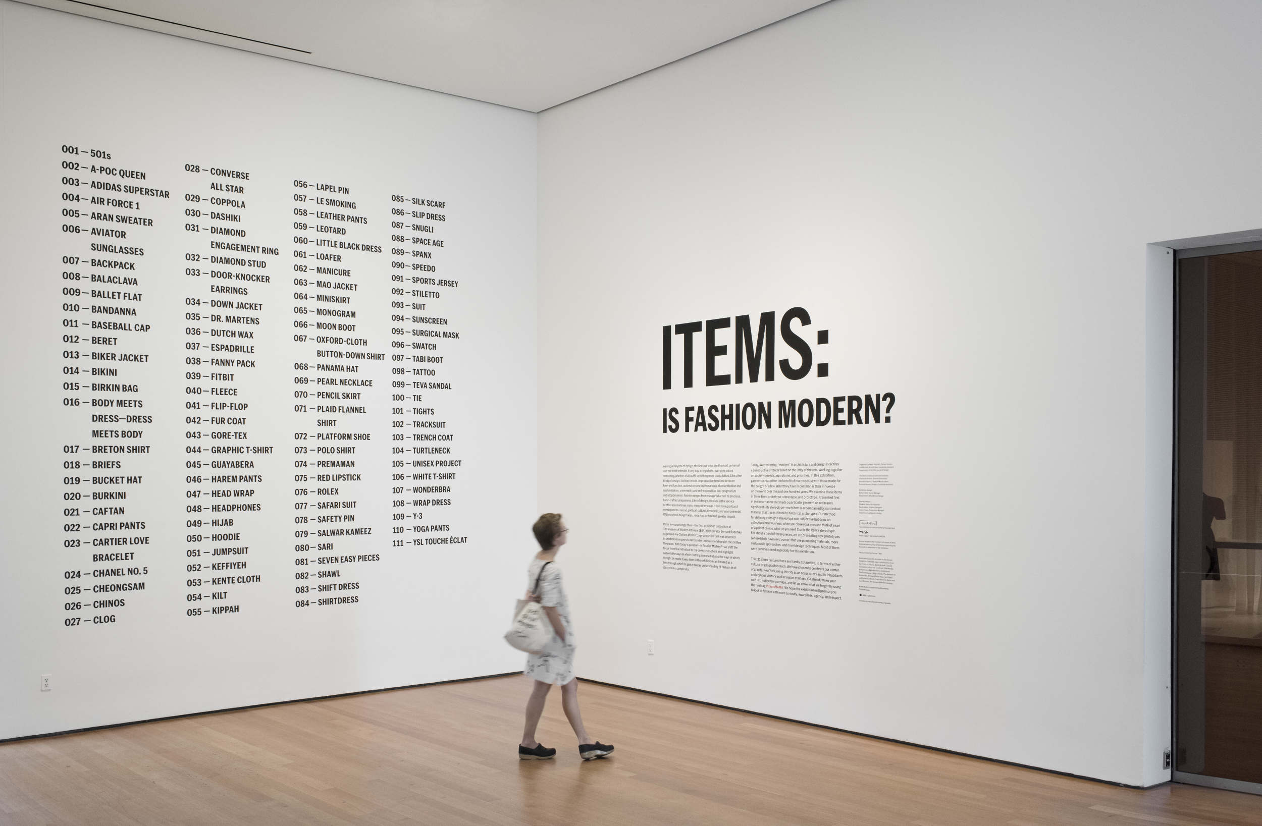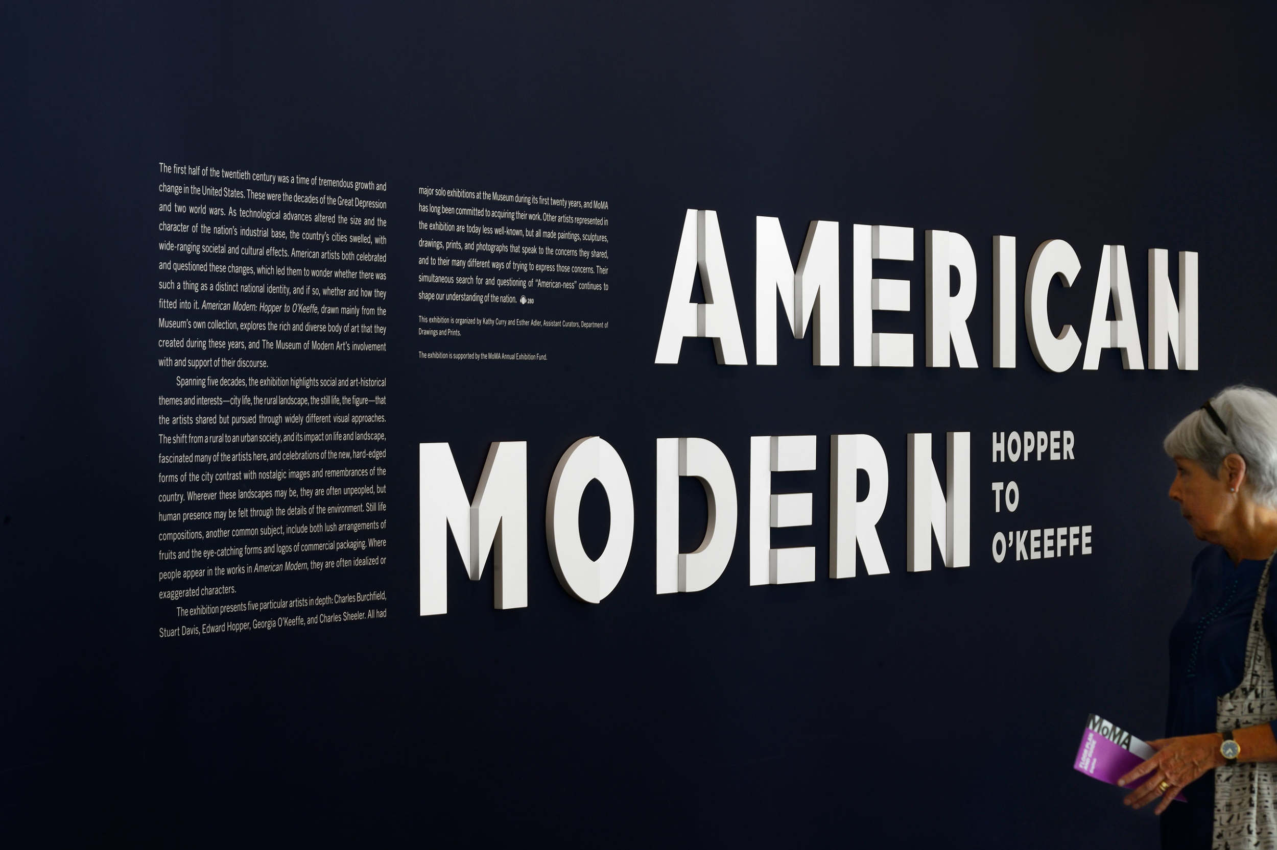

Exhibition graphic design plays an important role in museum. While doing exhibition graphic design this semester, I would like to write about my recognition of this topic.
Exhibition graphic design in general is the inhouse design for an exhibition. Where does the title go? where does the introduction go? What size they should be? Those are just the basic concerns or things to be achieved in the design. There are still other things need to be taken into consideration that is challenging.
The first challenge would be using typography only. Without any geometric element, no lines, no shapes, using type to represent the concept, including the idea of the exhibition or sometimes even the identity of the museum. The challenge exist in the arrangement of each letter, should they be break into different lines? Does the break make sense? Or does it serve any purpose? There are tons of question can be thrown on this decision made by designer.
The second challenge appeared when all the typographic setting are settled. One has designed how the title should be arranged and a relative size of how big the words should be. Then, it is the time to think of what effect should be on the text, what effect should be applied, and what material we should use in order to make it better. However, there’s a balance in the design which I found very delicate. How “cool” as we said should we made the design looks like? When I was actually designing it, a question pops up in my mind-does cool looking important under this situation. I keep questioning myself about what I am doing, what purpose my design served. Eventually, I realized, my work is just a combustion, an aide that would set the whole exhibition off and makes it looks better. Leading audiences’ focus towards the show itself is my job.

