As we all know, museums are where exhibitions being held. In another word, they are the place where art and design being displayed and showed to the public. Museums are like public transportation hub where it connect people to different destination. However, each landmark like transportation hub should have its own identity which people could recognize by seeing any relative information. The best example would be the logo and icons of subway in cities all around the world. So it would be even necessary for a museum to establish its graphic identity.
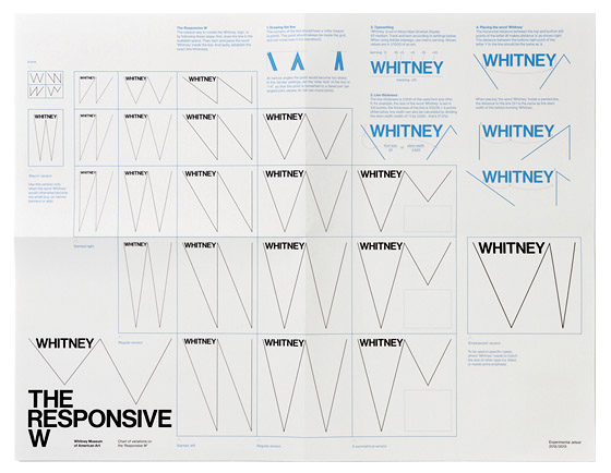
“Rather than as a logo or logotype, we regard the graphic identity as a system; a system that just happens to be represented as a line drawing.” I really like this line written by the graphic identity designer of Whitney Museum - Experimental Jetset. After reading their reflection on their project, I realize that all designs in the museum should be something to be discussed as a whole, but graphic identity is the crucial element that keep the consistency in all of the designs.
Take whitney museum for example, the use of “w” shape not only as a symbol but also work as a grid and the container for text and information. It’s flexibility allows it to serve different purpose, creating a platform for text in different hierarchy. Not only the symbol, the sign, works as part of the identity, but also font does too. Designers decided to use Neue Haas Grotesk as the font of Whitney taking its history and its connection between europe and America into consideration.